We have a couple of blog posts already about designing software for your products, and how to work out what the specifications should be, and how to work iteratively towards a lovable product. In this article we will discuss an approach to product feature prioritisation using the Kano model, which helps us classify product features.
The Kano model is the work of Japanese quality expert Kano Noriaki. The goal is to identify how customers will perceive the features of your product, and can help you decide which features to prioritise, or to identify areas where features in an existing product need to be enhanced or new features added.
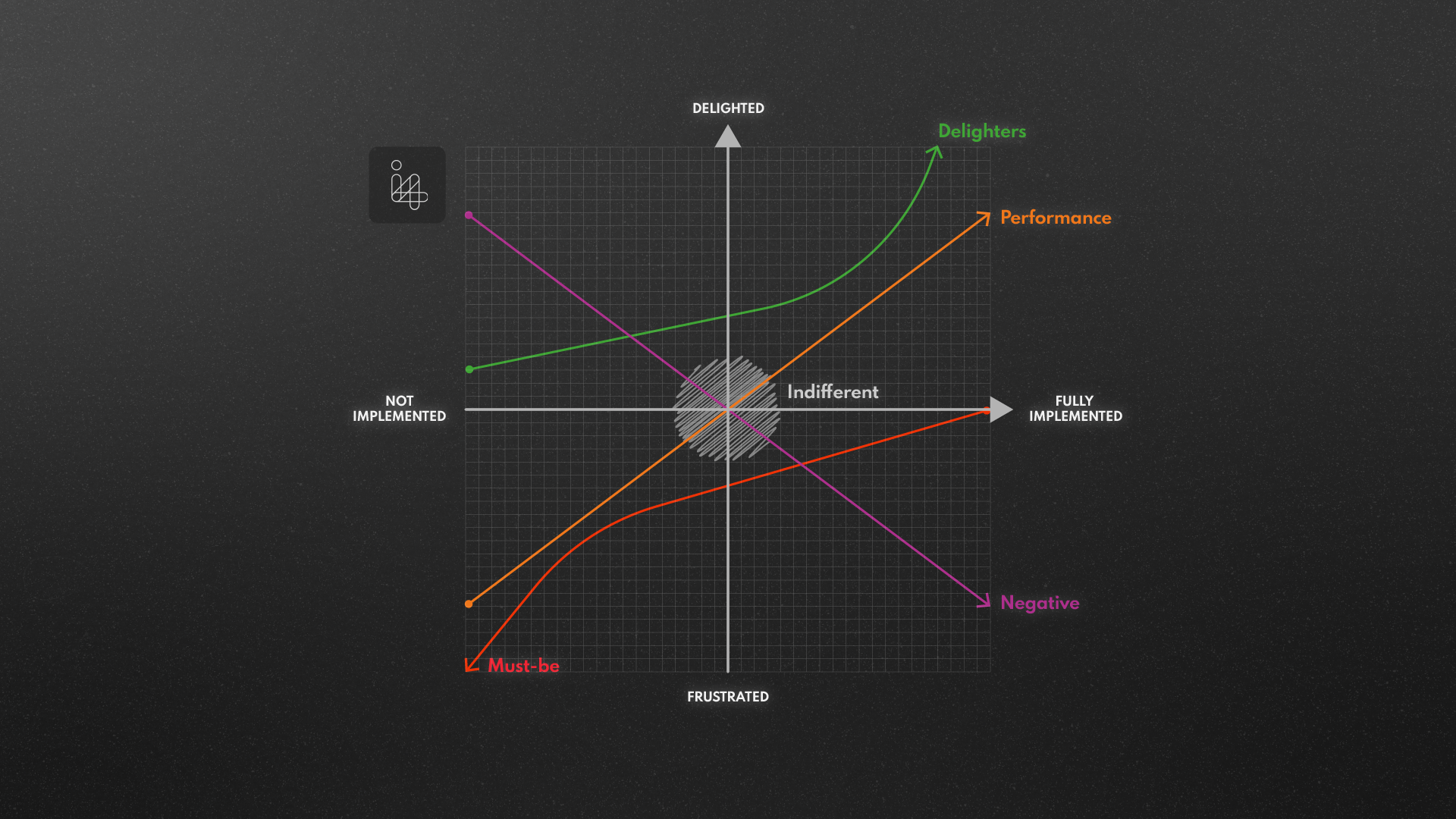
Kano (pronounced kah-no, not kay-no) proposed assessing features on two axes: customer satisfaction and feature functionality. Customer satisfaction is the Y-axis, graded from “Not satisfied” or “Frustrated” to “Delighted”. Functionality is the X-axis, graded from “Not implemented” to “Fully implemented”, or from “None” through “Basic” to “Best”. This two axis mapping is a core tool in product feature prioritisation, helping us evaluate how features and changes influence user satisfaction.
Kano identified a number of categories to which each product feature can be allocated. Which category they go into tells you how customers view the inclusion or exclusion of such a feature, and whether a better version of such a feature improves their view of your product. The category names vary, depending on who did the translation from the Japanese, but they are usually as follows:
These are features which your product needs to have! A car has a motor of some sort which propels it along, carrying the passengers; a coffee machine will make coffee; a table will have a flat surface that you can put things on. Omitting a feature like this doesn’t make a better or worse version of the product – it makes a different product, with a different market! Missing a “Must-be” feature can kill a product’s chance in the market stone dead.
These are features where the quality of the feature relates directly to how the customer perceives the product: the better the car’s consumption figures, the more people like it; the better the picture on a TV, the more people like it; the tastier the coffee from the coffee machine, the more people like it. If your product takes accurate readings more quickly than a competitors, it will please your customers.
These are sometimes called “one-dimensional” features because they are on a straight line if you graphed customer satisfaction vs feature performance. But of course a straight line goes in both directions: and that means that a worse performance will give you worse customer satisfaction.
These are features which offer something more than users expected. Better implementations of these features are better: but any version of a “delighter” just improves the customer’s perception of your product. Delighters can be the difference between a satisfactory product and a truly successful product. In practice, delighters play a significant role in product feature prioritisation because they offer competitive differentiation often disproportionate to implementation cost.
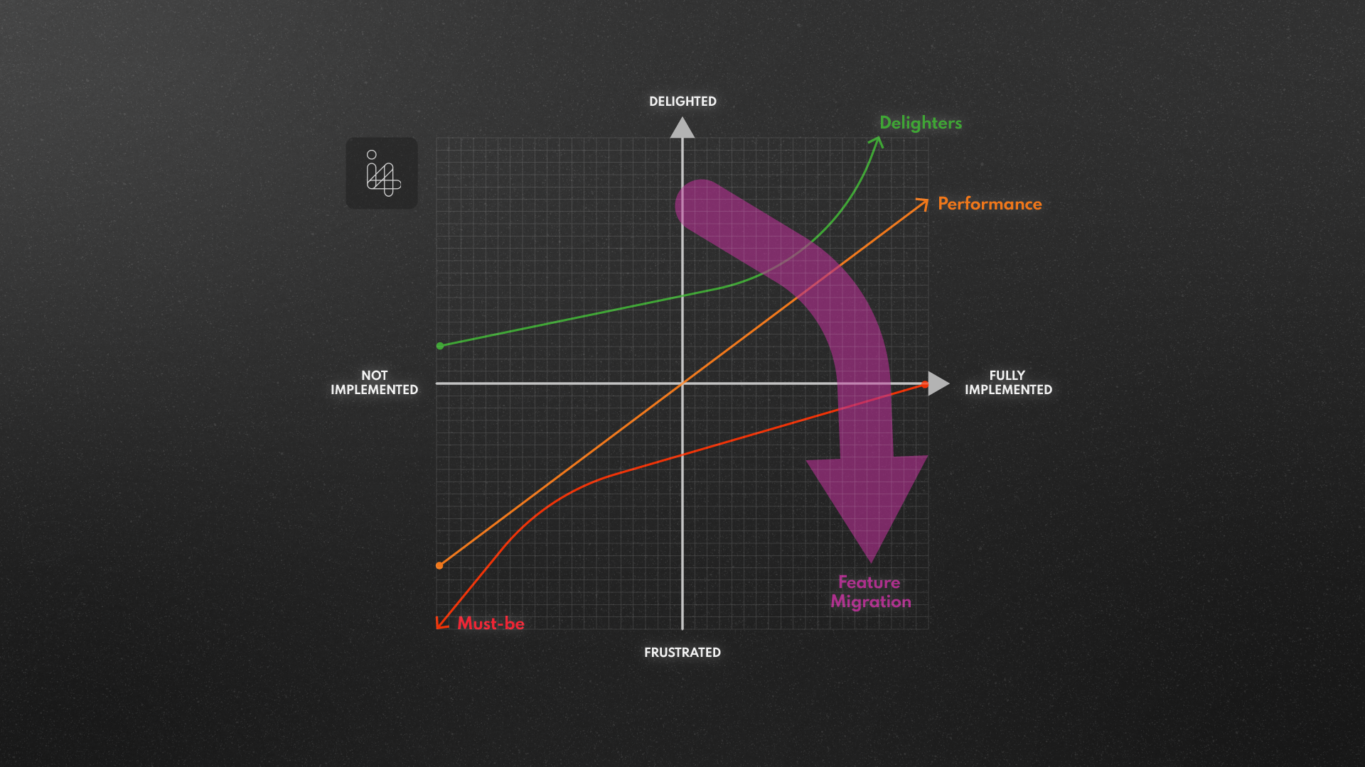
These product features can be visualised on a graph like this:
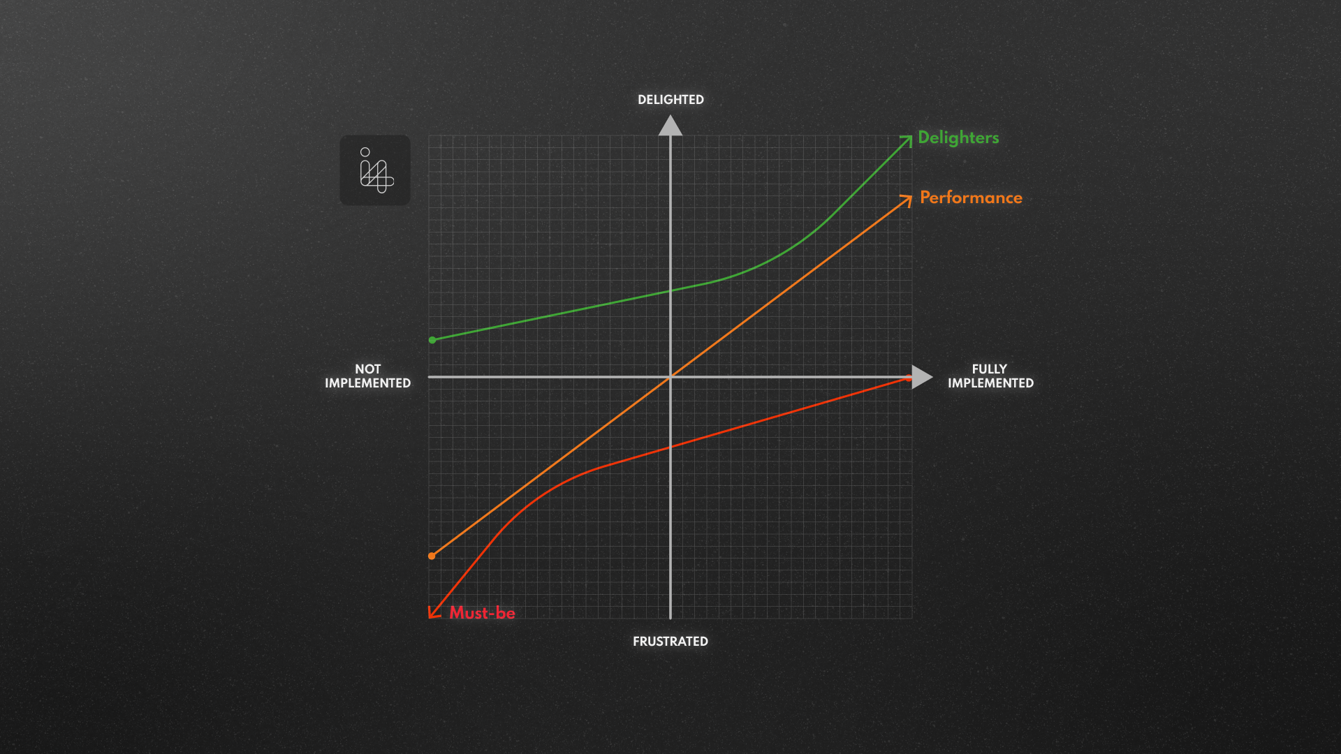
The graph shows you that even the simplest implementation of a Delighter will increase customer satisfaction: and a good implementation of a Delighter will have a much bigger impact than even the best implementation of a Performance feature.
Must-Be features, on the other hand, can make the customer more dissatisfied but, no matter how well implemented, will never give you a net positive satisfaction rating.
There are also more negative feature categories to think about:
These are features that the user just does not care about. Making this feature “better” or “worse” has no real impact on the customer’s perception of the product. You should only work on these features if, in fact, they are essential to the performance of the product (but your marketing shouldn’t waste time trying to promote them!).
This is the worst sort of feature to have: the better you implement it, or the more of it you provide, the less your customers like the product! Identifying these features – and then eliminating them, or at least reducing their visibility to the user – can save you from releasing a product that clients dislike, even if they buy and use it. Perhaps Microsoft Office’s “helpful” but annoying avatar Clippy is the ultimate example of the Reverse feature.
A factor which we have all experienced and which must be considered for a long-lived successful product is what we can call “Feature Migration”. This is the way in which features which were once previously unthought-of, or only available in top-end products, become more common, then commonplace, and finally taken for granted.
Think for example about central locking in motor cars: once a novelty to most, this is now available across all grades of car. You can no longer delight a car-buyer by unlocking all the doors in one action: if you tried to introduce a car to the market where each door needs to be unlocked individually you would find that the absence of central locking has become a negative. Central locking has gone from being a Delighter to a Performance feature to a Must-Have, and would only attract attention now if you do not offer it.
Mobile phones show the same feature migration. In the 1990s you might be pleased to have a phone with a 1” black and white display and battery life of just a few hours, in a package that was too big to comfortably carry in a trouser pocket. But colour screens, which were briefly a delighter, have now long been a must-be: and likewise touchscreens, smartphone capability, web browsing etc. are the minimum requirement, not delighters. This lifecycle shift is why product feature prioritisation must be revisited regularly as former delighters can quickly become baseline expectations.
A Kano Survey is a way to get input from users or potential customers to determine how they will perceive features in a product: will they be Delighters, Must-Haves – or Negative?? Conducting this exercise is an essential step for acquiring truly insightful product feature prioritisation data.
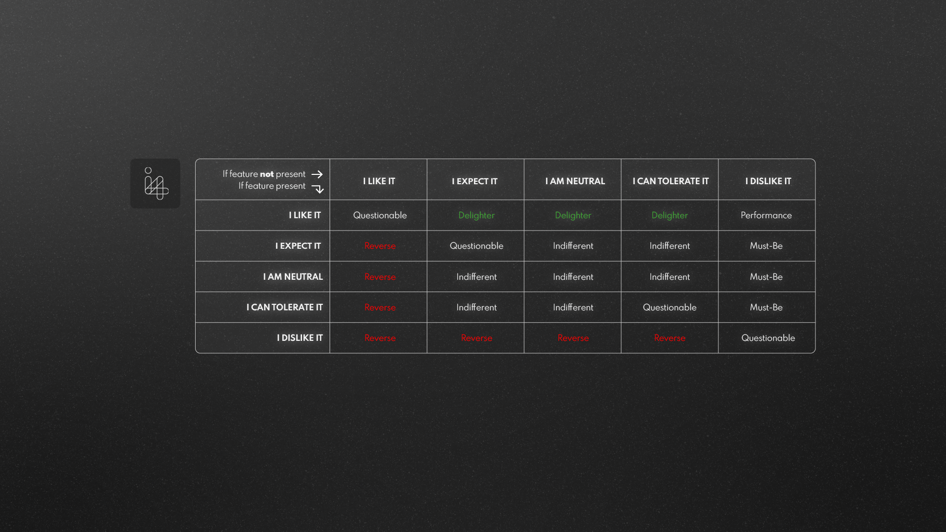
This is typically done by creating a survey which, for each feature of interest, asks two questions:
(These are sometimes called the “functional” and “dysfunctional” questions.) For each question the user can give one of 5 responses:
If you find a feature where the user says “I like it” if the feature is present but “I am neutral” if the feature is absent then that is likely to be a Delighter: the user isn’t expecting it to be provided but will be happy that it is.
For features where the user says “I like it” if the feature is present but “I dislike it” if the feature is absent then that is likely to be a Must-Have feature.
This matrix summarises the conversion from the survey to feature ratings:
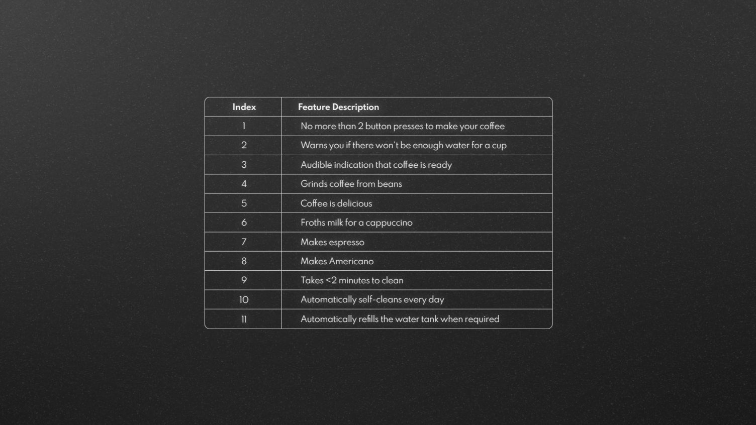
Let’s imagine we are going to design a new Coffee Machine. We come up with a short list of features that we think are worth implementing, based on our experience of coffee machines we love or hate:
We generate a set of Functional / Dysfunctional questions, and randomise them to try to make sure we get fairer answers:
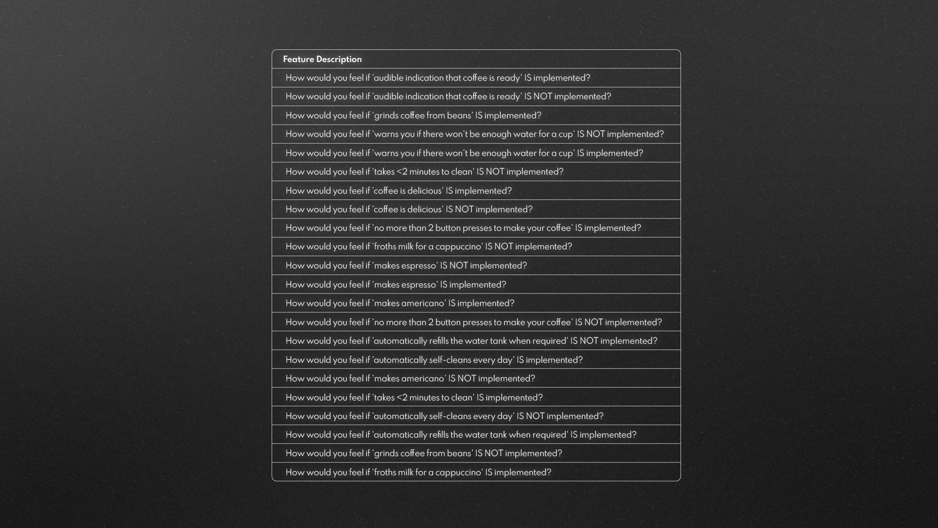
We send these questions out to a number of users as a Survey, where the response to each question has to be one of the fixed set of options (1).
For each respondent’s answers we can then score their “functional” and “dysfunctional” response for each feature to get a Kano category (2).
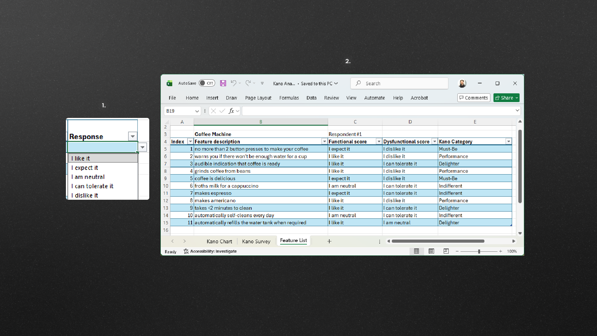
So here (from one person’s responses, so we need more data!) we can see some things that might be Delighters – audible indication that coffee is ready, less than 2 minutes to clean the coffee machine, automatically refilling the water tank.
To combine responses from multiple people we can take a simple majority approach – if “Performance” gets more hits for a feature than any other score then we can say it is a “Performance” feature. Or we can take a more sophisticated approach and apply a weighting (going from 4 for Like down to -2 for Dislike on the Functional question, and from -2 for Like up to 4 for Dislike on the Dysfunctional question) to each survey response and then average those scores.
If you take the numerical scoring approach mentioned above for combining individual response on a Kano survey then you can end up with a very interesting overview of your product’s features and how the end-users might view them:
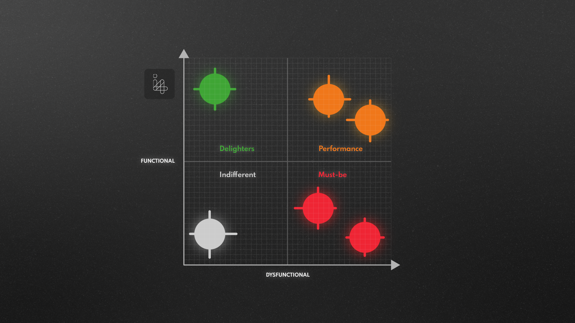
(The dots show the average scores, and the crosshairs show the variation between different respondents: this helps us see which features have good agreement amongst the surveyed users and which are more divisive.)
Hopefully this article gives you an overview of how Kano Analysis informs product feature prioritisation, leading to more customer aligned products and decision making. Perhaps this is an approach that could help to clarify priorities for features in a product you are thinking of designing?
If you’ve got a new product or idea you would like to develop, book a call to speak to one of our experienced engineers to discuss the next steps towards accelerating your product development.
To have a look at a selection of previous projects, please have a look at our portfolio of case studies.